Designing an LMS for K12 education
Almost all students, ranging from the age of 12 to 30 and above, have to use a learning management software to receive, write and deliver assignments. Many of these LMS's have been built many years ago, which makes them outdated and sometimes tricky to navigate without months of learning.

Abstract
Almost all students, ranging from the age 12 to 30 and above, have to use a learning management software to receive, write, and deliver assignments. Many of these LMS's have been built many years ago, which makes them outdated and sometimes tricky to navigate without months of learning. This comes from a constant need for new functionality, leading to feature creeps popping out.
This paper explores the possibility of creating a new, simpler LMS focusing on making a better learning experience for students in K12 education. We will explore how we could make learning more fun and include gamification into the system. In this paper, we also attempt to create a design that could be considered an improvement compared to today's LMS standards and seek to define a baseline for further work to be built upon this project.
Preface
This report contains a mixture of content written by a group and individual work. Everything from section 1. Introduction to section 3. Define was initially written as a group; these chapters may contain some of the author’s personal touches. The parts written by the group will mainly focus on data, information, and analysis of the user insight. The data and information are then used to set the baseline for the design we aggregated as a group. These other authors are listed below. The latter part of the report, from section 3.3, is written individually and will only contain information, quotes, and reflections written by the main author.
Supportive authors:
Fredrik Veland
Lilian Frederique Adriana van den Bos
1. Introduction
In today's world, everybody works online and in the cloud. However, many students and teachers still miss a good Learning Management System (LMS). In this project, we will be researching issues surrounding LMS' and use those insights to design a new LMS, providing solutions to any design defaults identified.
In this project, we have interviewed users, competitor analysis of direct and surrogate competitors, and performed tests with students and teachers. Afterward, a couple of personas was created to allow the new design to be in line with a persona's needs. And in the final part, we will discuss the final design, reasons, thoughts and ideas combining them with the end design used in the presentation.
2. Methodology
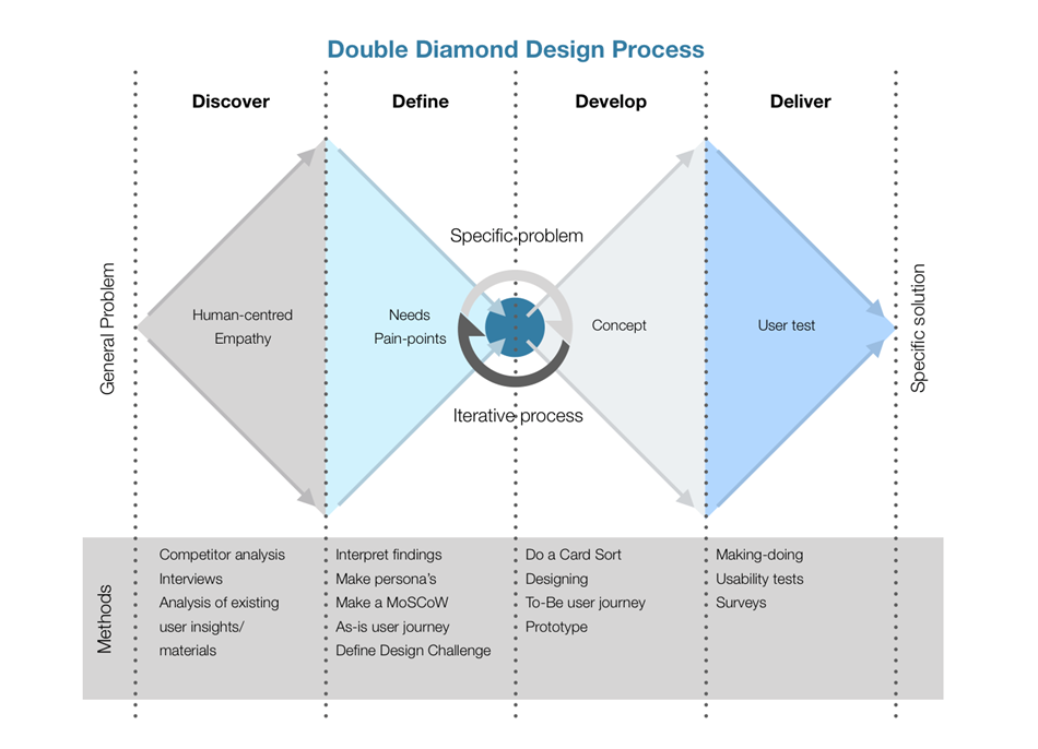
This project is mainly focused around a user-centered approach, which means that the end-users of a product is what we will be focusing mostly on. We want the product to fit the user and not the other way around (Baxter et al. 2015b, p.508). The users are the people who directly use the product (Daams p. 108 unknown). The end product must be directly relevant to the user's needs. To achieve this, we will have early research into the user's tasks and needs. By doing competitor analysis and interviews, we will empathize with our end users. The start of the Design Thinking process begins, where we use the double diamond design process. Design thinking is an approach biased toward a human-centered viewpoint and continuous experimentation (Baxter et al. 2015b, p. 11). We will support our findings by analyzing gamification in the classroom and the health of students nowadays.
In the defining phase, the previously done analysis will help set up a MoSCoW, which will support decisions made in the ideation and prototype phases. In the define phase, we will also set up personas. In the ideation phase, one starts with brainstorming and similar tools to work on an idea. In the prototype phase, we will select a few ideas from the ideation phase, and these will get tested by users. After which we pick one idea and make a high-fi prototype of which will get tested.
3. Research
3.1 User Research
In this report, the LMS users are defined as both the teachers and the students. During the analysis, both secondary school and university students were interviewed. The university students were also included during the user research to allow an overall more comprehensive set of data to work with during the design process. They are also heavily reliant on LMS'.
3.1.1 Students from secondary schools and University (12-40)
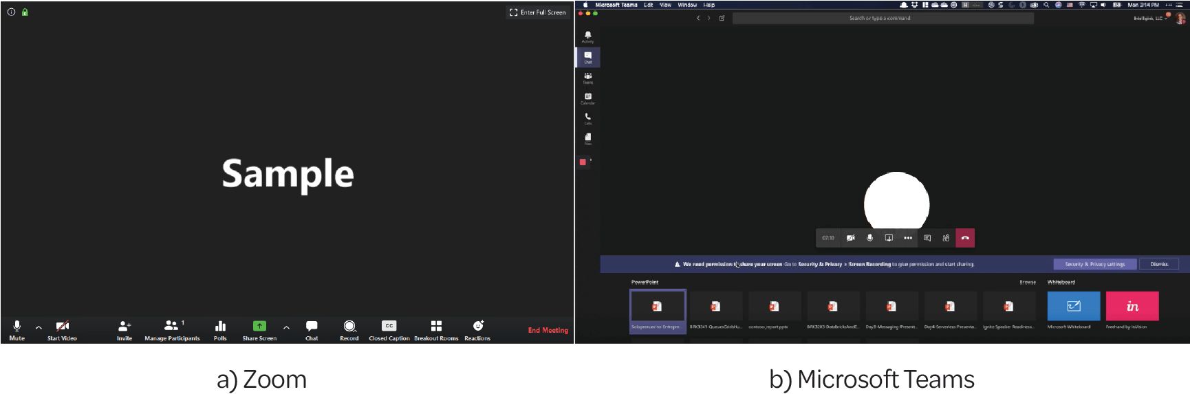
Usually, at around 12 years old, people go to a secondary school in Europe until 19. Often, these students must deal daily with an LMS implemented by the school or the local regulatory body; this includes university students. During an outbreak that happened in 2020 (Covid-19), it has become common to use meeting systems that allow the teachers to perform lectures or meetings with the students. This is done by using, for example, Zoom, Teams, or other similar programs during a regular school day.
A regular student during the outbreak has to use somewhere between 2-6 different tools of communicating, depending on their school system. During most of the interviews performed, we found that many of the students found it irritating that they must switch between the various programs all the time. Some schools also did not use a set of labels standardized across all courses, and menus were sometimes complicated and irritating to navigate. This would mean that if they change school for some reason (graduate or moved) may use an entirely different system which would confuse, if not limit, their use of the said system for the time it takes to learn it.
Sometimes a school selects a system that works on a general level; for example, one student only uses the Google Suite (Docs, Sheets, Meet, classroom, and more), which made it easier to use, and they could find documents and shared data in the same system. However, tools such as Microsoft Teams are not built for lecturing but for meetings of professional nature.
We also asked what they would like to have in their system, and the most common thing they wanted was that the profile and courses could be found quickly and that navigating between the pages would be easy.
3.1.2 Teachers at secondary schools (20-60+)
The interviewed teachers often had two (or more) different LMS's they had to deal with regularly. Moreover, they were often in need of other programs to support their lectures, which they found irritating.
In one of the teachers' systems, one of the interviewees found it confusing that there are many tabs through which one must navigate to find the correct area. Both teachers also liked that students could not interfere with that system to keep it organized. One of the teachers mentioned that the problem they had with Zoom was that they needed to send a link every time they would hold a lecture.
One of the more essential factors motivating students to pay more attention to the lessons was to include games. The interviewed teachers noted that by using rewarding systems or games, like Kahoot!, Menti, or Lesson Ups, they would pay more attention to the lessons.
Conclusion:
It became clear that both teachers and students want all the different programs included in one software. Or at least reachable via one software. However, they liked the Teams and Zoom software's functions, like that they can easily share documents (teams and Google Classroom) and get breakout rooms (both teams and zoom). Secondary school teachers liked that with their LMS's the students could not interfere on their platforms. Besides, all teachers regularly use a game in class to see/get the students' attention.
3.2 Competitor analysis
This research aims to get a sense of what kind of products (LMS) are already available on the market. In this analysis, we want to get a sense of the strengths, weaknesses, functionality, USPs, user experience, and labels used in various products.
3.2.1 OnderwijsOnline for HAN University of Applied Sciences (students POV)
OnderwijsOnline is meant for everybody that is either a teacher or a student at the HAN University of Applied Sciences. At OnderwijsOnline, students can look at documents teachers have posted and upload assignments. Students can also see their assignments, find links to the "Insite" (The internal page) of the HAN, to their grades, and their schedule.
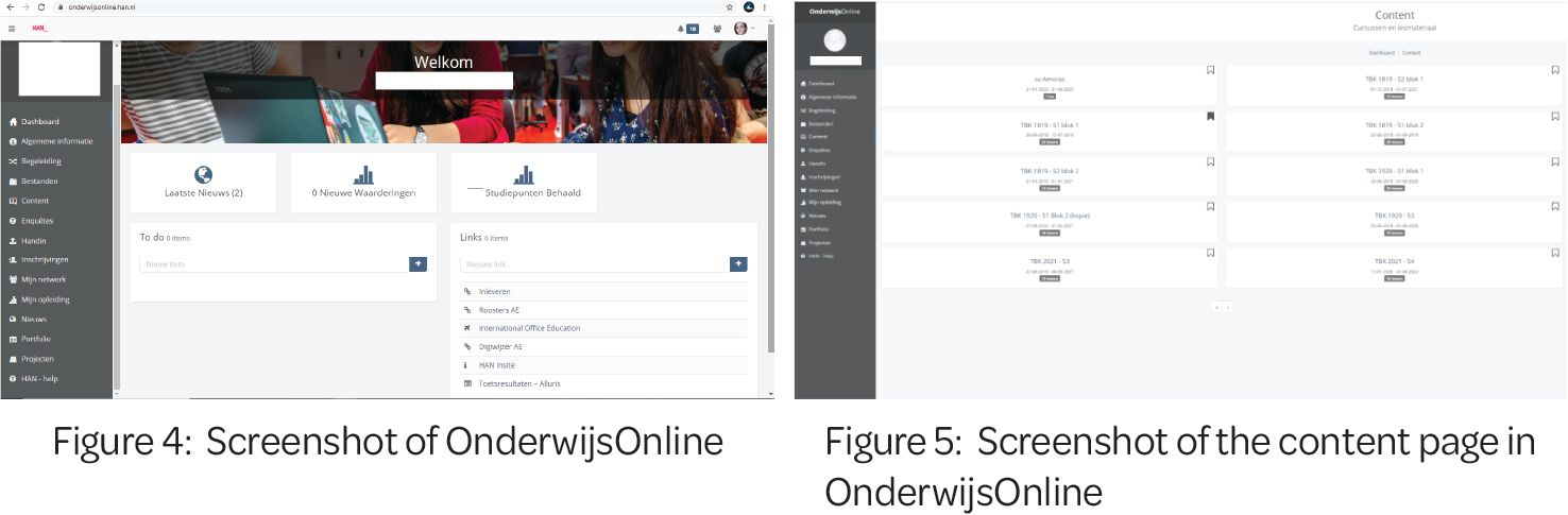
The majority of students liked the easiness of the navigation. Weaknesses are that they need to have multiple sites or programs for different goals. However, overall the students liked the easiness of the navigation. Weaknesses are that they need to have multiple sites or programs for different goals.
The students found it irritating that not all parts of the menus in OnderwijjsOnline are used, making it very confusing to navigate to find the correct page. Another program is used for schedules together with this LMS to allow users to put their schedules in their calendar.
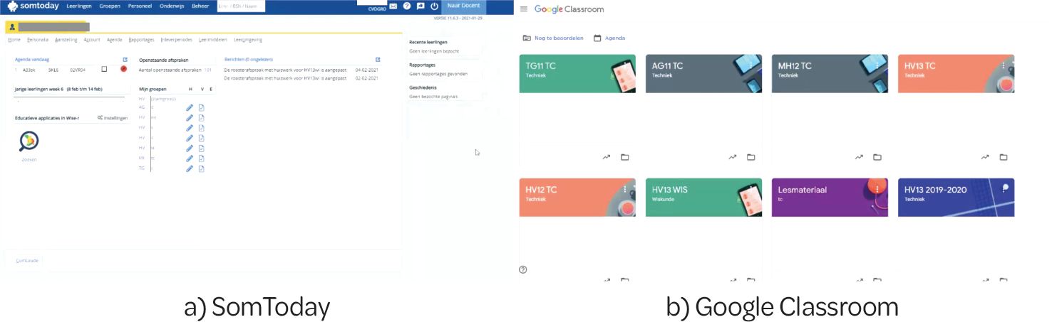
3.2.2 SomToday (teachers POV)
SomToday is meant for secondary education, for either the teacher or the student. Teachers can add tests, grades, attendance, and schedules, but they will have to use another site (like Google Classroom/Drive) to add documents. As the teachers noted in the interview, one would need too many different websites to add info on if this were split up. They also mentioned that there is "too much going on" on this website, and you often will get lost. Therefore teachers sometimes give assignments via Google Classroom/ Drive or use mail instead of using the system provided.
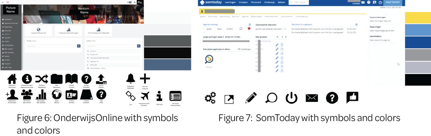
Labels used (EN (NL)): Students (Leerlingen), Classes (Groepen), Staff (Personeel), Education (Onderwijs), Management (Beheer), Search for student number/ personal number or name (Zoek op li. Nr/ BSN/ naam). And some symbols like: Mail, Help, Facebook, and Log out. And a button for go to their own (teachers) page.
Submenu labels (EN (NL)): Home (Home), Personal Details (personalia), Position (Aanstelling), Account (Account), School reports like grades (Rapportages), Hand in periods (Inlever perioden), Learning tools (Leermiddelen), Leaning environment (Leeromgeving).
3.2.3 Google Classroom
“Classroom helps students and teachers organise student work, boost collaboration, and foster better communication.” (Google 2021) The core value of google classroom is that it is simple, minimalistic, and has a “form follows functions” mindset.
Students have access to almost everything a teacher has, except for some core functionality, like grading and creating new courses. What the teacher sees is most likely what the students will see, making it easy to create something that looks decent.
A pain point noted by a user of this LMS, was that at least one of the labels was not great and did not make that much sense. The three prominent labels are “Stream”, “Coursework”, and “People”. The user was struggling with the label “Stream”, what does stream mean in this context? All it does is show posts, quizzes, tests, assignments, and everything else in chronological order. This does make it easy to find specific things that have been posted recently; however, the name does not imply posts or other assignments. A more straightforward “Announcements” or similar would presumably be better suited for this task and label. Teachers have an additional “grades” link, which they can use to both view and grade students. They can also see the class average for the tests and deliveries performed. Since Classroom is a Google product, it is highly integrated into the Google Suite, allowing users not to switch to another system and interrupt workflow. Things like Docs, Slides, and other tools needed to perform the tasks are always ready to be used and help them continue focusing on their assignment.
3.2.4 ItsLearning
“ItsLearning is easy to use, saves you time and works in all levels of education.” (ItsLearning 2021). ItsLearning LMS is primarily meant for and used mainly by K12 and higher education, called high school and higher education in Norway. ItsLearning has a variety of tools and features for when it comes to communication, collaboration, Mobile learning, assessment, reflection and development, reporting, and organization tools. Over the recent years, ItsLearning has made several improvements to its UI and overall user experience and design to look how it does today. Shown in figure 8 is an example of how ItsLearning looked a couple of years ago.
Over the recent years, ItsLearning has made several improvements to its UI and overall user experience and design to look how it does today. Shown in figure 8 is an example of how ItsLearning looked a couple of years ago.
The primary navigation in ItsLearning is done using the global navigation menu at the top of the site. This menu consists of a total of 9 tabs. Most of the main tabs also consists of several sub-tabs which can be seen in figure 9. Like in the older version when needed file structures are shown in a “Menu” on the left as is shown in the image above figure 8.
ItsLearning offers several different features ranging from organization, communication tools, collaboration tools, mobile learning tools, assessment tools, reporting tools, and tools for reflection and development. Which they list in more detail on their website (ItsLearning 2021).
Teachers can create courses and sign students into them, and write and publish news and announcements regarding the course. They also have complete control over what functions and features are available to the students on their course page. Functions like organization, communication tools, collaboration tools, mobile learning tools, assessment tools, reporting tools, and reflection and development tools are available.
ItsLearning is available on mobile IOS and Android. On the mobile version (figure 10), ItsLearning uses a broad but shallow information architecture on the web/desktop version and a narrow and deep mobile version. With the mobile version being reduced and simplified to only a basic file structure. One comment often made by users of ItsLearnings web version users is the following: “ItsLearning has a lot of great functionality but it has a steep learning curve for first time users”.
3.3 Gamification in the classroom
In this analysis, we look at gamification in the classroom. Gamification is “the use of game design elements in non-game contexts” (Deterding et al. 2011). In several papers it is tested if Gamification has an impact on the grades and if student learn better because of gamification. These game elements can be: wager option, progress bar, encouraging messages, quizzes, and goals (Sanchez et al. 2020).
Sanchez et al. 2020 stated that students who completed more quizzes performed better on tests. Students who completed gamified quizzes had better scores than on their first test. However, more gamified did not make a difference. Also, the students that already had higher grades, achieved more from the gamification than lower grades students. In overall the gamification only worked for short-term assignments, and teachers should not always use the same gamification method. All these results also differ per student, since if one student gamed more than the results differed.
In the research paper of Hitchens and Tulloch (2018) was implied that the students found that the gamification is a useful technique for addressing motivation and engagement of the students. However, there were still students with a negative view towards the method. It is believed that though it can help it should not be the main focus of the way of learning. The students that participated in this study might have been biased since they study media and games studies. Based on the results presented in this paper it is suggested that although gamification can be enjoyable, the software does not have to deliver a game-like experience.
. . . Basing definitions of gamification (or games) on a set of mechanics is problematic.. . . gamification could be understood more broadly as a process in which the ‘gamifier’ is attempting to increase the likelihood of the emergence of gameful experiences by imbuing the service with affordances for that purpose (be they badges, points or more implicit cues). (Huotari and Hamari 2017)
Conclusion: gamification will help some student to get better results so it would be good to have it on the LMS. However, it should not be the only thing to help the students learn their learning material. It should only be a implicit side benefit that enhances the system rather than being focused around it.
3.4 Health of students
In a study done by Health Information (2005) about health in young people, they reported that young people aged 12-19 who feel connected to their school tend to have less anxiety and perform less risky behaviours, such as smoking and drinking alcohol, compared to those who do not feel connected to their schools.
During the pandemic year of 2020-2021, many young people had to stay at home, which could have and most likely has increased the amount of stress of young people and made them feel less connected to the school system in general. This is perhaps because everything from classes to social events had to be done online, and people could not connect the same way they did before.
The ongoing stress relating to education has demonstrated negative impact on students’ learning capacity, academic performance, education and employment attainment, sleep quality and quantity, physical health, mental health and substance use outcomes. (Pascoe et al. 2020)
As the current state of online learning is still in its growth phase, the system could, in fact, not be prepared for an all-online learning environment. Young people around the age of 10-16 are still in an unexplored social explorative phase, which was interrupted by the physical school system's shutdown. Without a system that can easily allow for online growth, socializing, and education, many students feel ostracised from reality; some are presumably even feeling unattended, abandoned, and left out.
Conclusion: Our goal should be to aim for a system that allows the young students to feel more connected to their school and classmates.
4. Define
In this section, we are defining what our problem is, what we can do to solve it and what we need to do. We are also showing what type of persona we are working with.
4.1 Problem statement
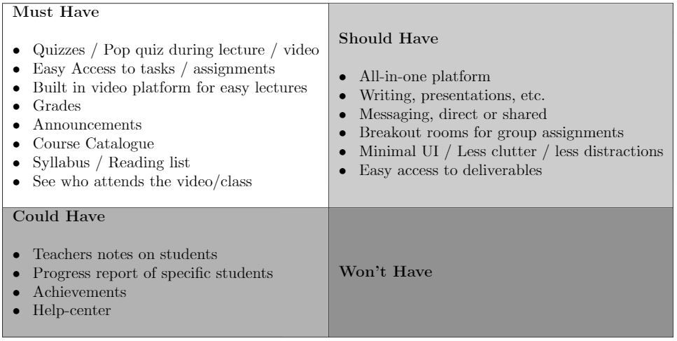
As a result of the analysis made the problem to solve is: “How can we provide a good Learning Management System, with all the software a student and a teacher need to have a good online learning/teaching experience?”
To solve this, we structured a MoSCoW. MoSCoW is a method that allows the team to prioritize the different features that they will work on. Features are then categorized into “Must have”, “Should have”, “Could have”, or “Would like but won‘t get”. This allows us to get a clear hierarchy of what needs to be implemented and what is not feasible to include within the current constraints (Digital Society School 2021).
4.2 Personas
Personas are created to get an idea of a “typical” user (Baxter et al. 2015a). Persona’s are created because it is sometimes difficult to connect with an abstract description of something. It will also allow the team to keep the focus on these specific users. The following persona’s were created based on our research.
5. Results
During the initial part of the research, it was found that a majority of students use many different tools to communicate. One of the most common tools used was Google Classroom and Onderwijs Online, each with their pain points.
One of the critical problems mentioned was that there were too many tabs and led to it being confusing, requiring the students to have to spend more time than necessary finding an assignment or the information they needed.
As we were mostly using children as our basis for gathering insight, we will not be able to share exactly what information was gathered.
5.1 Lo-Fi iterations and design ideas
This section contains some of the Lo-Fi iterations that was used to create the more fledged out design.
5.1.1 Lo-Fi Iteration 1

The top navigation works well on Google Classroom because the LMS is part of a more extensive overarching system that integrates calendars, documents, files, chat, and many more functions into this system.
For this system, we would need a more extensive amount of links, as many of the functions available in the Google Suite is not available to us. That would mean that since the top navigation does not allow for more than six links. The maximum of six links is based on limited space available in a horizontal orientation and the space needed to separate two links from each other.
Having horizontal navigation works well if one has many sub-pages like a marketplace such as ebay has. One could more easily categorize the information in a larger submenu with more categories inside it. Which is the positive side of this, however, this is also a detriment for any smaller websites (such as an LMS), as there is not enough content to make it usable.
5.1.2 Lo-Fi Iteration 2

The design is still clunky, with too much going on on the screen at the same time. There was also the problem of it feeling overwhelming, which meant that not enough spacing was used. Designing a product that is usable for a younger audience, there were a couple of problems noted. Mainly using space and removing unnecessary information on the screen is essential.
Though Google Classroom does not use this design, it also does have less functionality built directly into the system. For example, one cannot directly view their files in the system, and one would have to visit a separate webpage to access them. We would want the student focused on the main content rather than the entire page, so minimizing the amount of information needs to be of priority, and more space was needed.
A part that had to be improved was the size of the sidebar. In fig 15, it was found that the text could become too long, depending on language, and that could make the text wrap in an undesired way.
Why choose a sidebar navigation instead of top?
Because the amount of flexibility available to the system operator, allowing us to expand the uses for more functionality rather than being limited to the 3-6 links available in a top navigation without going into sub-menus.
5.1.3 Grid Design
It should also be noted that in hindsight, the amount of spacing using between the boxes was too large and would be better if closer, which is why a second iteration was created to suit an even smaller spacing as seen in figure 17 below.
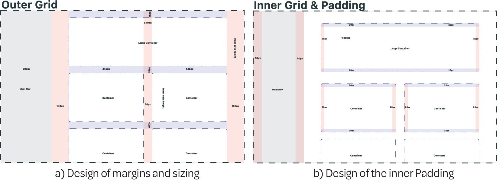
In comparison, figure 16 and figure 17 are quite similar in how they function. The main reason they are quite different is how the information within them is perceived; this is done by “using varying amounts of whitespace to either unite or separate elements is key to communicating meaningful groupings” (Harley 2020).
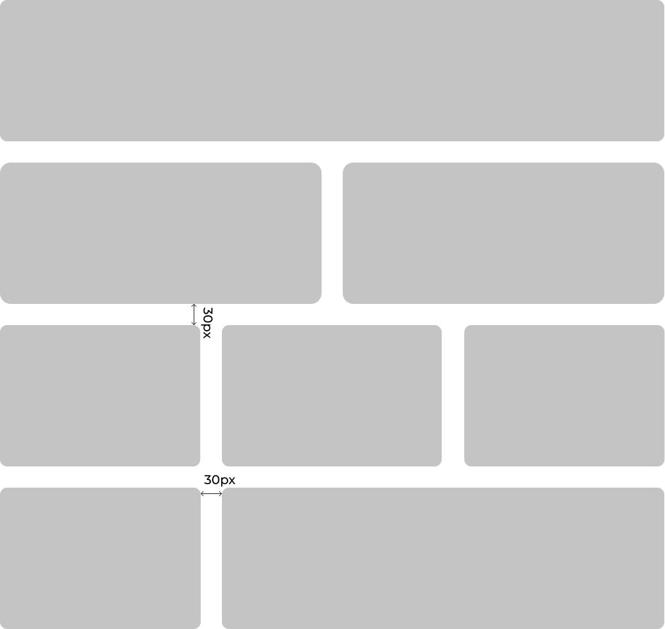
We could classify the grid-based layout as one of the more critical design choices in this design was that it was of utmost importance that it had a functional framework rather than a finished design. The framework would lay the foundations for how this system developer could implement and further extend it within these boundaries. Take for example the figure 18, which was implemented in fig 27.
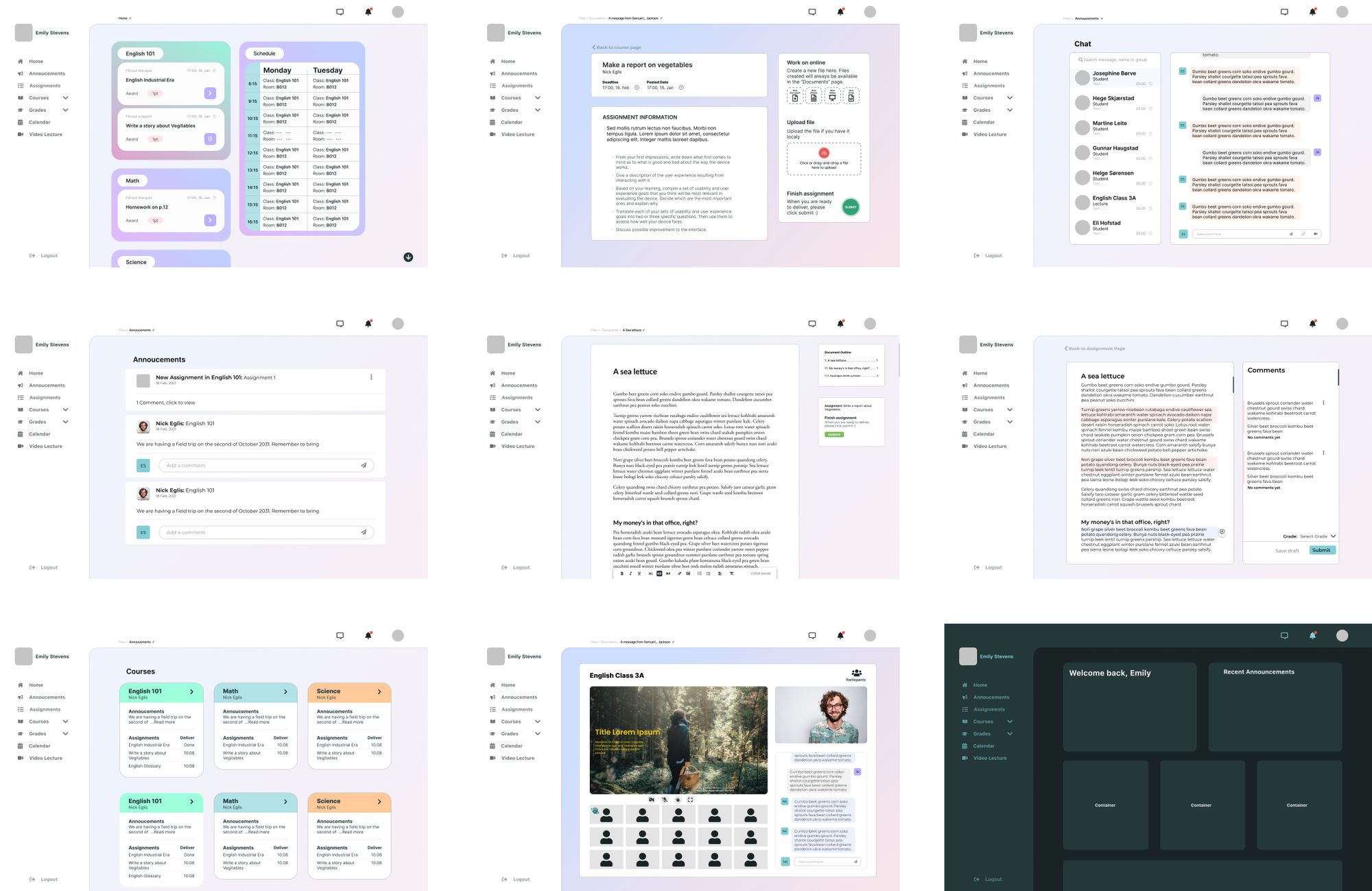
5.1.4 Hi-Fi iteration design
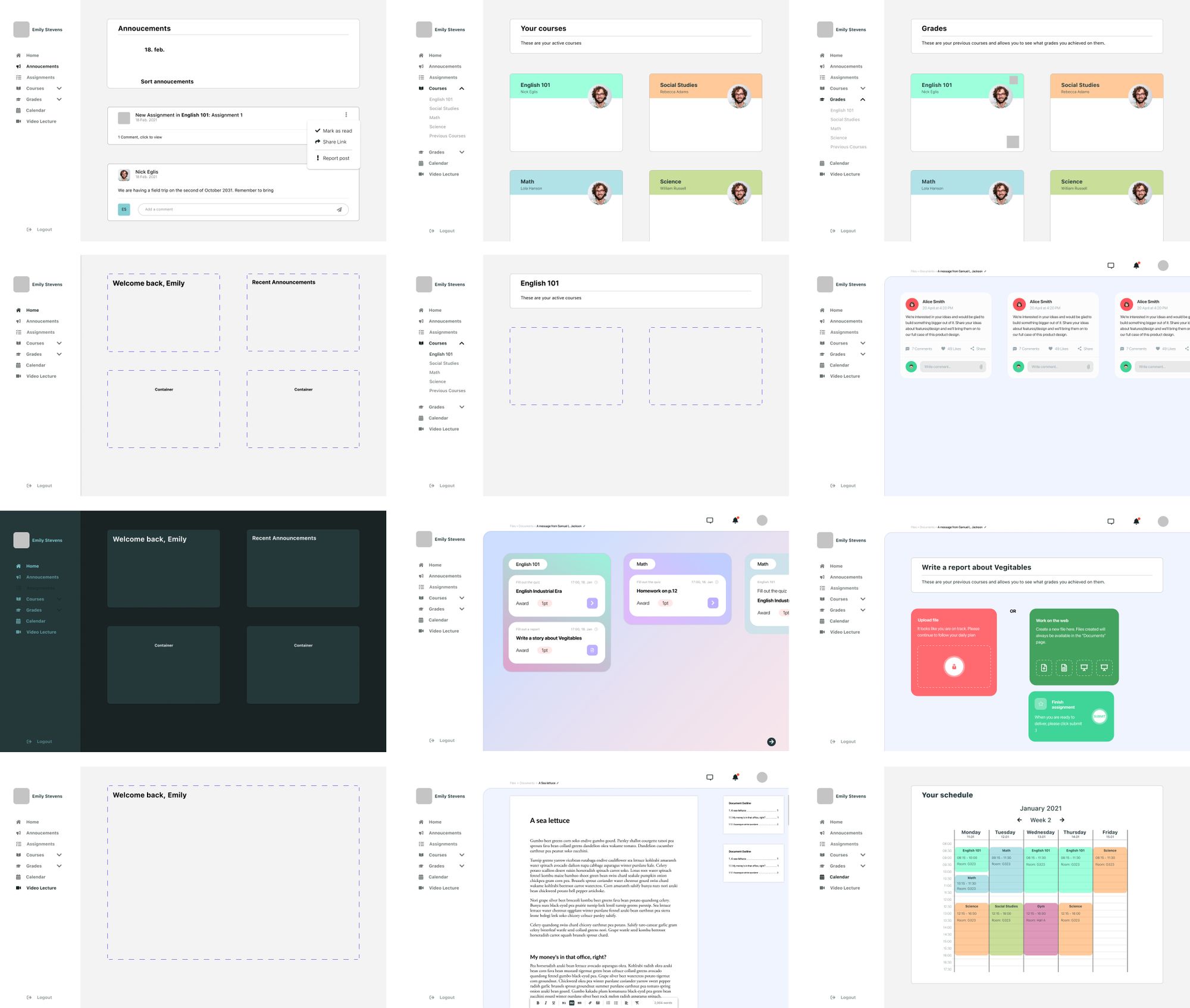
5.2 Prototype
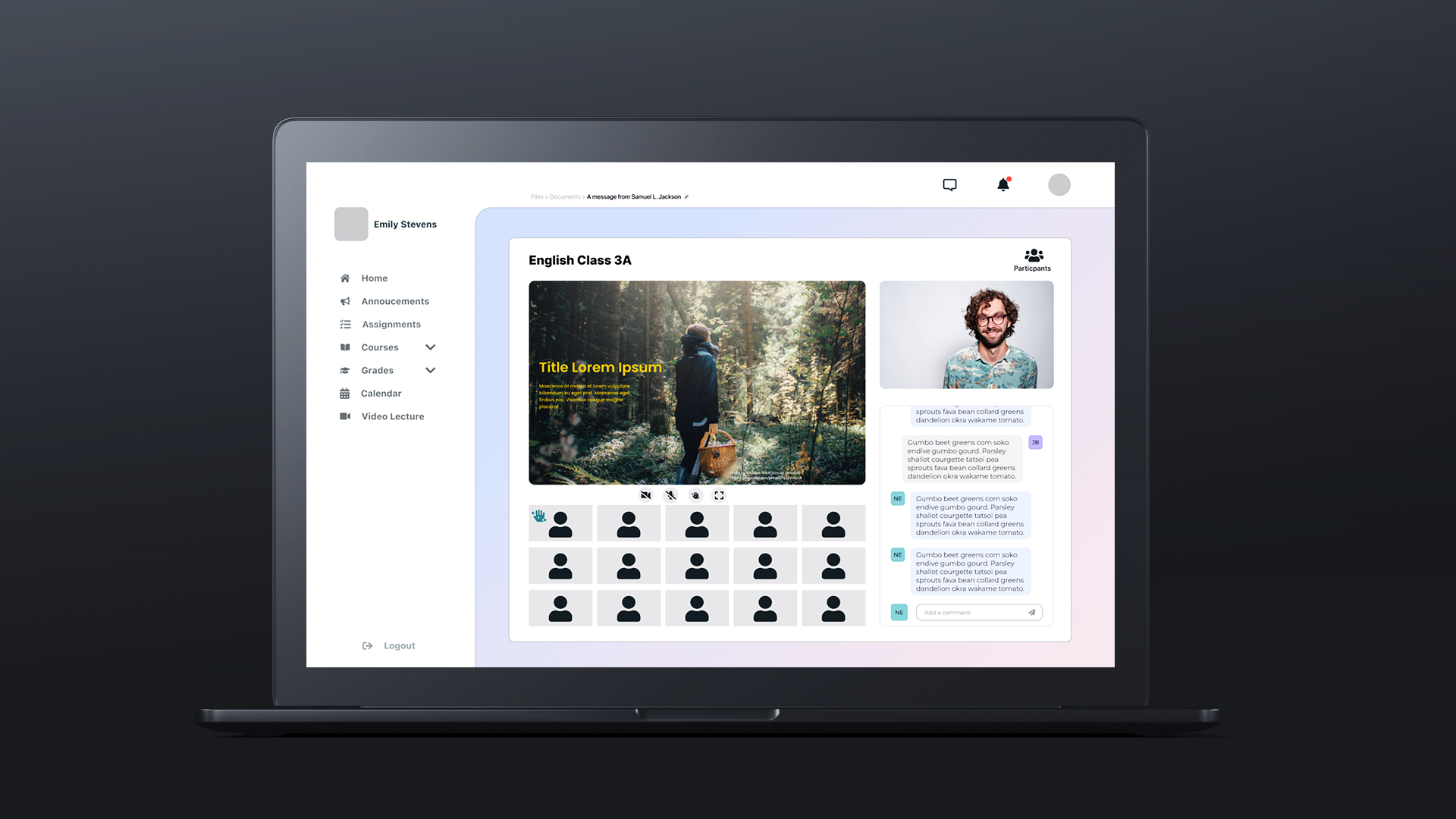
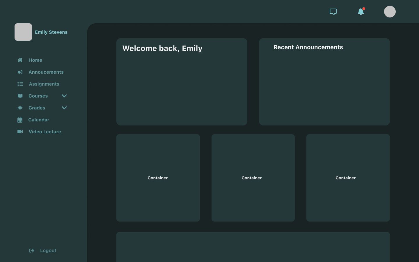
One of the parts that were of most interest, was the ability to round the corners, making them appear more playful. Not all parts have the same roundness in them, as seen in figure 20. This was by choice, as the option to hide the top navigation could help the students personalize the content to fit them even more.
6. Discussion and reflection
In this section, we will discuss the reasons behind design choices and some of the problems faced.
The main problem faced in designing a new LMS is that the project's scope could be considered too broad. It was an enormous undertaking to design a completely new system from the ground up based on just a limited dataset we produced. Though it should be stated that LMS' is used in most schools in some form or another, we felt that this was something we could attempt. We based this project on our frustrations with the current system used by NTNU, which has proven to be both irritating and disorienting. At the start of the project, there was also an assumption that it would be similar for the younger generations.
As one would expect of such an enormous undertaking, we were a bit short on the information necessary to create a well-functioning, adaptable and testable design. However, this is not because of a lack of trying.
Another problem faced was that the information gathered was too meager and could only serve as a basic set of information to help lead us in a direction at the start. With such a tiny sample size, the information we gathered would only benefit us by providing some verification to our initial assumptions about current LMS' and would not aid in further work.
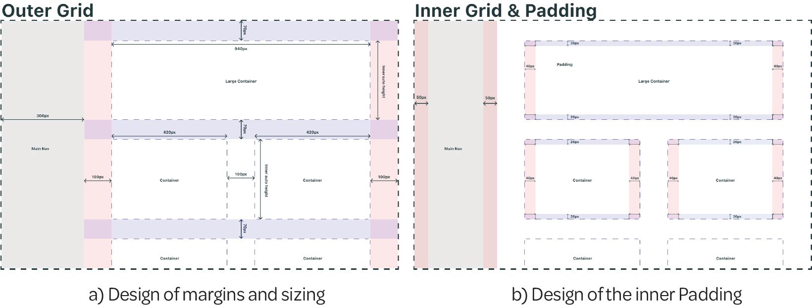
6.1 Grid-based design
One of the major designing points is the grid system used to design all design. By designing with a heavy grid influence, the design might look a bit cleaner than if we were to use less structured ways. It also helps to utilize as much space as possible, without having it look cramped. The flaw that comes with it is that we cannot utilize other design ideas and flowing design techniques.
6.2 Designing for children
When designing for children, we have to consider that these children often have a minimal attention span, which means that we have to think about limiting the brain capacity needed to do a task. Having things become too hard would make the user not enjoy using the service and could become confused.
An article written by BBC News (2002) stated that most internet users spend less than one minute on the average website. As this article is written in the year 2002, and we know that there has been an increasingly large amount of websites, content, entertainment, we assume that the attention span has dropped even more than when this article was written. One of the key points is to make content more engaging and easy to use is more important than making it extensive and customizable.
In a paper by Morschheuser et al. (2018) they reported that “Various studies report positive psychological and behavioral outcomes of using gamification, for in stances on motivation, social interaction and performance”. Having game-like elements might help the students participate; however, having too many of them might make it feel forced. For example, one could add a point gathering system, but if not well built and used correctly by the teachers, it does not help the students get motivated, but instead become less motivated based on that fact. This will, not only decrease the learning ability, but also decrease the value of the point system and lead to more problems than it solves.
As stated earlier, children are more susceptible to a gamified system and could have an increased learning outcome; however, this is only a speculation at this point. We know that for a fact, gamified systems allow students to learn a subject more efficiently; this also means that a system that is wrongly built would lessen the effect of the school overall.
6.3 Multi-user design
One of the more significant problems that teachers noted was that they did not see what the students saw all the time. We noted that to see what the students were seeing, they had to click on a special button built to see this side of the website. This was a less-used function, and that was something we would like to avoid. This is why the design is meant to function for both student and teacher and only give the teacher a small additional function to add new content or edit previously added.
6.4 Fonts, icons and color
In this section we'll go into detail about the different fonts used in the prototype, the color choices and why these icons were chosen.
6.4.1 Typography
The choice of font was based on a preconception that at least half the users would have access to an Apple device, so having something seemingly familiar to this would be preferable. People working on laptops running either Linux, Windows, or Chrome OS would have many different fonts available, making it difficult to adjust the design.
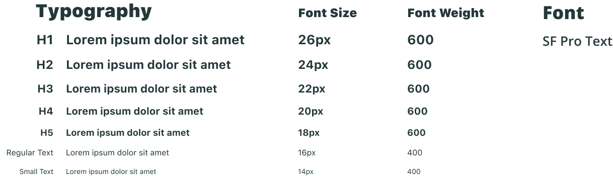
Therefore, the font of choice became, therefore SF Pro from Apple to start with. However, this design, not being an Apple product, making the use of this font not allowed for this specific purpose without explicit permission by Apple itself or is focusing on iOS related content. There was an attempt to find a font that worked on smaller font sizes without looking disfigured, deformed, or otherwise missing the contrast required.
2. Permitted License Uses and Restrictions.
A. Limited License. Subject to the terms of this License, you may use the Apple Font solely for creating mock-ups of user interfaces to be used in software products running on Apple’s iOS or OS X operating systems, as applicable. The foregoing right includes the right to show the Apple Font in screen shots, images, mock-ups or other depictions, digital and/or print, of such software products running solely on iOS or OS X. (Apple 2021)
This lead to the finding of the Inter typeface family, which is quite similar to the SF Pro family. As stated on Inter’s website, it is a typeface carefully crafted & designed for computer screens. And features a tall x-height to aid in readability of mixed-case and lower-case text (Inter font family 2021).
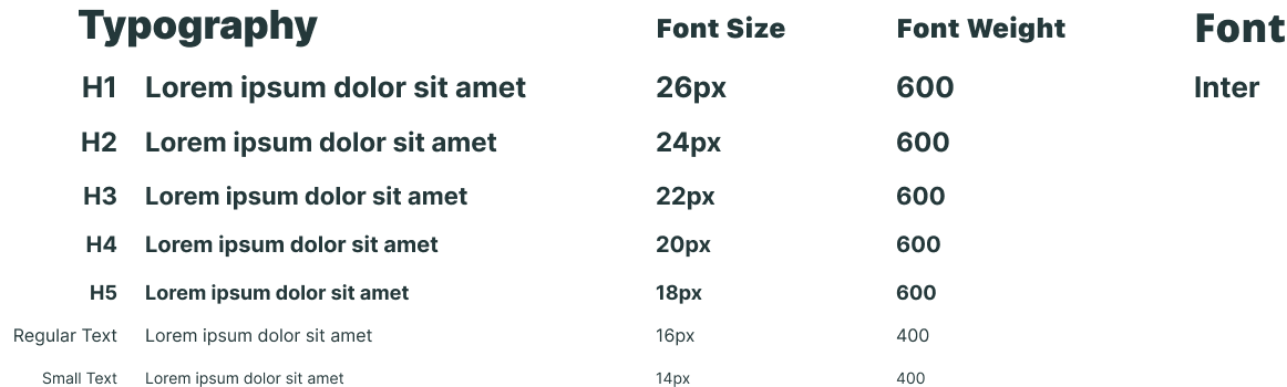
One of the fonts' requirements was that it had to be easy to read, for both small screens and large. It also had to be a pretty typeface.
Though most of the pages have the same font, there is a couple of exceptions. These exceptions are mainly focused on writing documents and files. It was necessary to have a font that looks good and functions exceptionally well on screens and printed paper. Though there is not much scientific evidence in favor of having serif fonts on paper, it is often just used as styling. Though because of conventions, it is by far simpler to pick a serif typeface than a sans-serif font for printed works.
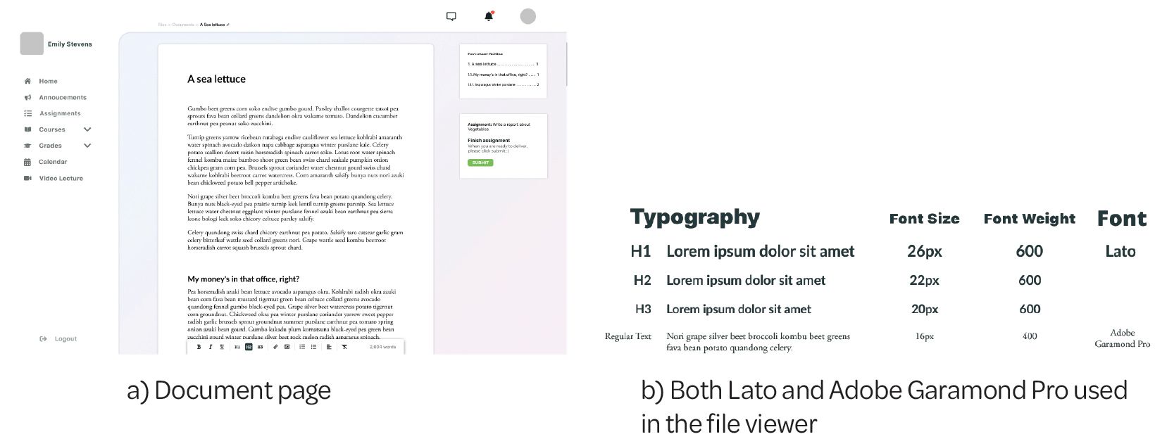
In the process of creating a file viewer, there was a question of extensiveness that was raised. How much freedom should children have in selecting fonts, colors, and other options when working on a document? Would that affect the teacher's ability to read the final file?
In hindsight, a better font for reading on screens than Adobe Garamond Pro should have been chosen and only been the font given to the teacher. A sans-serif font would perhaps be better for writing texts, as it is easier to read this on a screen. This, of course, depends on the screen size and pixel density, as it is essential to choose fonts designed to look good in both print and on screens, as we do not know where the user will use the font.
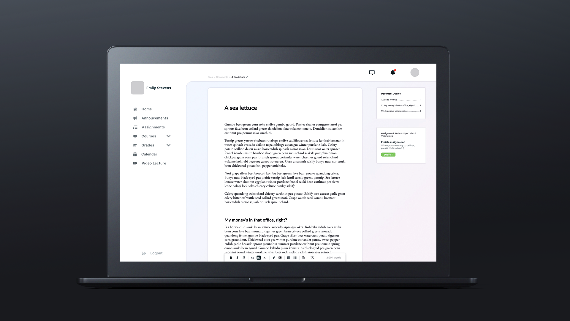
It was decided that rather than having a fully-fledged word processor, a minimal processor was necessary. Giving the students the bare necessary word designing options for an assignment allows us to have a standardized set of projects delivered to the teacher on the final delivery. Which would make reading and grading easier, as the document will look the same, and the contents would be the main focus.
It could be argued that this is too limiting in choices; however, without a valid and practical reason to have any more, one should not add more options than necessary.
Having a feature-rich interface can make navigation difficult to learn and overly complex (Nielsen, 2017).
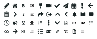
6.4.2 Icons
One of the major problems facing any design is if they want to use icons or not. While it might seem like an obvious choice to use it, one would need to have a valid reason for using them. It is important when using icons that they are there as a visual aid rather than the main focus. These visual cues can be used for advanced users to find links and tools quickly.
Both of the following heuristics from Jakob Nielsen are related to the statement above.
#2: Match between system and the real world
The design should speak the users’ language. Use words, phrases, and concepts familiar to the user, rather than internal jargon. (Nielsen 2020)
#6: Recognition rather than recall
Let people recognize information in the interface, rather than having to remember (“recall”) it. (Nielsen 2020)
The iconography must make sense in terms of what they do for the user, so a carefully selected set of icons that match the design and sizing is of utmost importance. In addition to this, they need to be used in such a way that they are non-intrusive, making sure that they are not the main focus but rather accents in the holistic design.
6.4.3 Colors
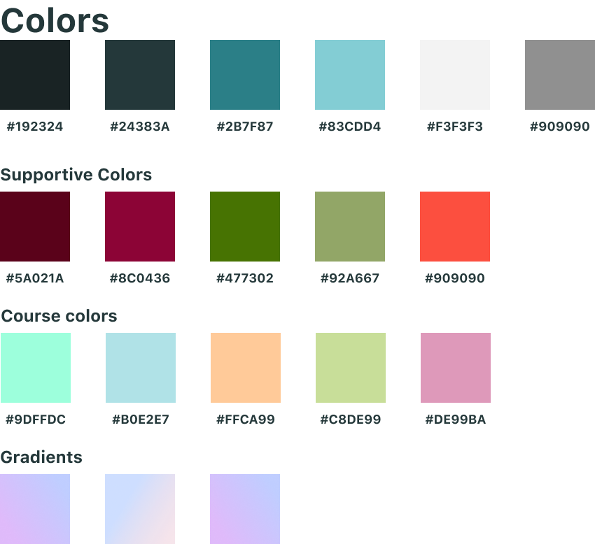
Colors are the basis for most designs, it is what makes the design pretty and can help guide the user. The choices of colors were meant to be related to nature. The top 6 colors seen in figure 26 were all the base colors used for text, backgrounds, links, and other text-related items. These colors were selected from a photo of an iceberg and act as the primary colors. The top left color seen in fig 26 was created, so the main text is not purely black.
In a paper by Aleman et al. (2018), they stated that “black text on a white background overstimulates the OFF ganglion cells while white text on black background overstimulates the ON ganglion cells.” This study advises against reading black text on a white background due to the striking effects of contrast polarity.
And in a blog post by Antony (2018), he stated that high color contrast is useful for readability. Too high of color contrast, however, creates a significant disparity in light levels that affect the user’s eyes when they read.
This is also why the added dark-mode design was added, as seen in the figure 27 below. Some people might prefer having a darker color such that they do not strain their eyes too much with a lighter color. A darker color might also appear more relaxing than the lighter counterpart.
Another part of the colors, the gradients, seen at the bottom of figure 26. They were created to support the playfulness we would want to achieve with the design. Having a soft gradient playing in the background would only be there for aesthetic reasons while also supporting the playfulness of the design.
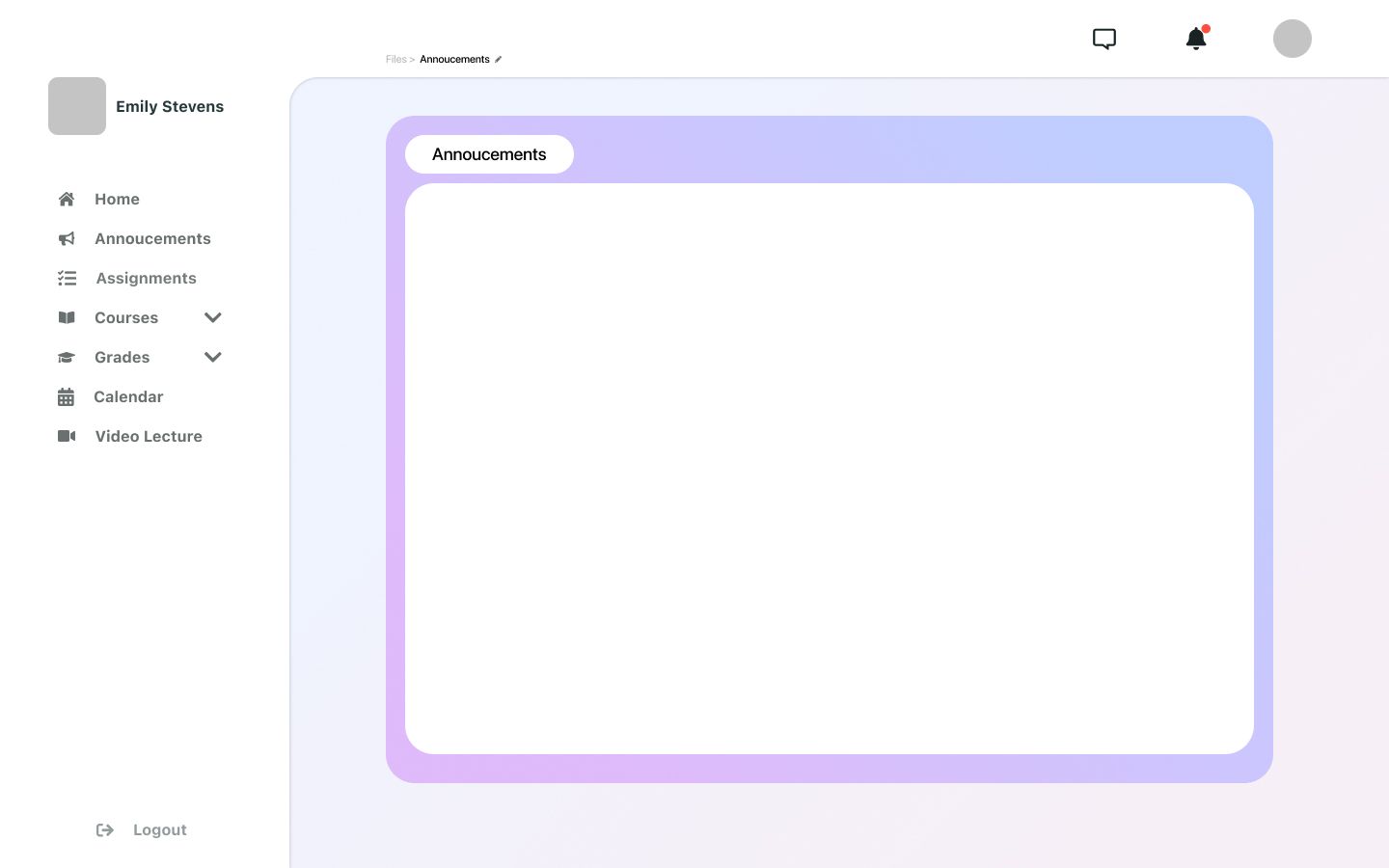
Having a background that is not white additionally assists further attracting the attention of the user to the part of the design that has a white background.
Reflecting on the gradient used in figure 28 to box in the white content, we should state that it would be too saturated for a minimalistic design like this. Furthermore, it is something that should be improved if one were to redesign this design. The background in itself is perfectly saturated, as it does not draw too much attention but is still there to enhance the design.
The stylistic choice seen in figure 28 was also the main one tested on users, in which we got the comment mentioned below in the next section.
6.5 User testing
Throughout the project, we performed user testing to get some information about uses; while we did get some information, we should state that the number of users tested on is too small, and the information we got was biased to friends and children of friends. While this does not pose a severe problem for this project, these tests' overall validity could be counted as inconclusive evidence at best. This type of user testing would not be valid for a full project, as the information gathered would be lacking.
A simple user test was performed on two children using Google Classroom as their LMS. The users tested came with a couple of pointers that could need improvements. Here is one positive and one negative comment that was received during the user test. “It’s a little bit too distracting”(Speaking of the colors around the main box), and “I liked having access to everything directly at the home page” (speaking of the navigations).
While this was not the optimal choice in terms of users for testing, because of timing and not being available to test in person, the two online were the most that could be gathered in a span of a week.
The main change that was done to the final design was to remove the gradient boxes around the main content and only have the soft gradient background, as this would be easier on the eyes and less distracting overall. We also selected the “white” background to be pure white to contrast the gradient backdrop to a substantial degree; we also used no pure blacks because of the reason stated above.
6.6 Presented design
We found that selecting just one design as the task described would have required a more extensive period of designing for the final design that we would present. We believe this because the content would then be required to be adapted into the style of the design it was added to.
This would mean that, since the project was built as a single designer, it would require a lot of time for the other designers to adapt their method of designing content into the design prototype. Another problem that might occur is that if the designers are not familiar with the stylistic choices, one designer would have to spend additional time adjusting or editing the new parts of the design to fit within the boundaries set by the original design.
We found that creating a new design, picking only the best parts and ideas from each other, would facilitate an overall better and easier experience when designing the new design. This allows the other designers to know HOW we want the design to be without requiring extra time to design and possibly fix the design to fit correctly.
While it might seem like this is not the greatest way to do this, it would prove to be the better option, as we then had time to problems faced in the previous projects.
Though the design shown in the iterations above was mostly focused on the layout, color, and grid-based design, we built the final design to fit within the same principal design rules. Like the designs in this project, it was built to be extendable rather than provide a complete, fully functional system.
We could argue that creating the layout first rather than the content would be a terrible way of doing so. Since the end product was supposed to be a “fully-fledged out design”, I opted to design specific parts and grids rather than the entire design. And then, in the combined design, fill the content out.
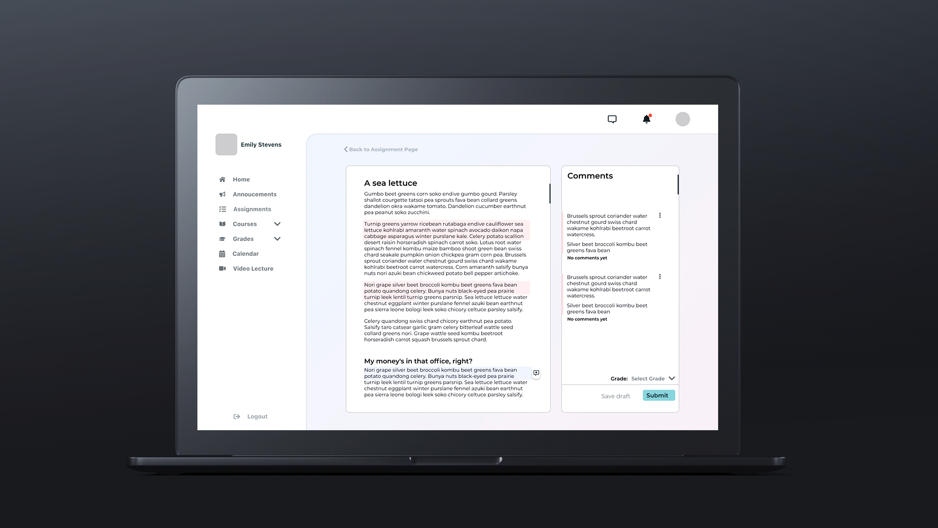
For example, the merged design is presented in appendix C; it has elements from all the different designs. However, it is built upon the same modular design created for the previous iterations while also taking parts and content from the other designs.
7 Conclusion
Here we have defined the baseline design for creating a simple, fun, extensive, and engaging design. Finally, we also presented some studies.
While the presentation design (see appendix C) was built upon a more extensive information set and more content, it was only possible because of design choices and selections based on the designs provided and combined by everyone in the group.
The initial tests done on the new design showed improvements, however, it would require work to allow the design to become finalized. Additional tests should have been done.
To conclude, did we manage to create a good, well-functioning, new LMS to such a degree that it could be implemented right now? No, the amount of research done, students tested on, and the amount of work would not be sufficient to create a new LMS ready for use. However, it has laid the groundwork for it to be improved upon and could become a more extensive project later, where more tests and design should be done.
Support Me
Want to support my work, consider supporting me through either of these ways.
